Klaveness Combination Carriers
Brand Guide
Last updated January 2023
Logo
The blue logo is mainly used on white backgrounds. When applied to darker surfaces you should use the white version. If you cannot use the main logo due to lack of spacing, use either the portrait or landscape versions, whichever is most suitable. The space between the logo and other elements must be consistent. The minimum amount of clearance around the logo must be equal to the size of the letter “a” in the logo.
Concept logo
Klaveness Combination Carrier products or services are to be branded in the same visual profile as the brand itself, using the same color scheme and font. When marketing products or services, they should always carry the post-fix “by Klaveness”. The minimum amount of clearance around the logo must be equal to the size of the letter “a” in the logo.

Font
The primary font is Source Sans Pro designed by Paul D. Hunt and can be downloaded for free. When Source Sans Pro is not an option, Arial can be used. Visit this site for conditions of use, and download the Source Sans Pro font package.
Brand wordmark
Edit Serif Pro is the font used and reserved for our logo only.

Colors
The color palette consists of 12 colors. Orange is the accent color of Torvald Klaveness and should not be used by any other Klaveness company.

Dawn Blue
Screen: #05586B
Screen: RGB 5/88/107
Print (CMYK): 93 M55 Y43 K20
Pantone: 7476 C
Paint: NCS S 5540-B30G

Vivid Blue
Screen: #00A5C8
Screen: RGB 0/165/200
Print (CMYK): C88 M0 Y11 K0
Pantone: 312 C
Paint: NCS S 1060-B

Blue 50%
Screen: #667290
Screen: RGB 102/114/144
Print (CMYK): C65 M51 Y26 K9
Pantone: 285 EC
Paint: NCS S 3050-R80B

Dusk Blue
Screen: #032A33
Screen: RGB 3/42/51
Print (CMYK): C93 M67 Y60 K60
Pantone: 3308 C
Paint: NCS S 7020-B90G

Bright Blue
Screen: #426DDB
Screen: RGB 66/109/219
Print (CMYK): C77 M60 Y0 K0
Pantone: 285 C
Paint: NCS S 2065-R90B

Sea Blue
Screen: #398EA2
Screen: RGB 57/142/162
Print (CMYK): C77 M30 Y30 K0
Pantone: 326 C
Paint: NCS S 2050-B80G

Grey
Screen: #A49FA9
Screen: RGB 165/160/170
Print (CMYK): C38 M34 Y24 K06
Pantone: 436 C
Paint: NCS S 3502-R

Grey 50 %
Screen: #C7C2C7
Screen: RGB 200/195/200
Print (CMYK): C25 M22 Y17 K01
Pantone: 435 C
Paint: NCS S 2502-R

Grey 30 %
Screen: #EFEFEF
Screen: RGB 240/240/240
Print (CMYK): C07 M05 Y06 K00
Pantone: 434 C
Paint: NCS S 1002-R

Silver
Screen: #BDC3C5
Screen: RGB 189/195/197
Print (CMYK): C0 M0 Y0 K30
Pantone: 877 C
Paint: NCS S 2502-B

White
Screen: #FFFFFF
Screen: RGB 255/255/255
Print (CMYK): C0 M0 Y0 K0
Paint: NCS S 0300-N

Black
Screen: #000000
Screen: RGB 0/0/0
Print (CMYK): C0 M0 Y0 K100
Pantone: Black C
Paint: NCS S 9000-N
Accent color
Vivid blue is the accent color of Klaveness Combination Carriers, and is used for emphasis in the color scheme. It is a bold and bright blue that should be used sparingly to emphasize and create contrast.
Vivid Blue
Screen: #00A5C8
Screen: RGB 0/165/200
Print (CMYK): C88 M0 Y11 K0
Pantone: 312 C
Paint: NCS S 1060-B

Color use
The following color combinations are allowed when working with multiple colors. Consider the color proportions when using the various colors as displayed in this guide. Bright blue is the accent color of Klaveness Combination Carriers and is used for emphasis in the color scheme.

Principles
Example of how to apply the Klaveness Combination Carriers brand

Templates
In this section you will various templates, scroll down to find:
PowerPoint template
Power BI template
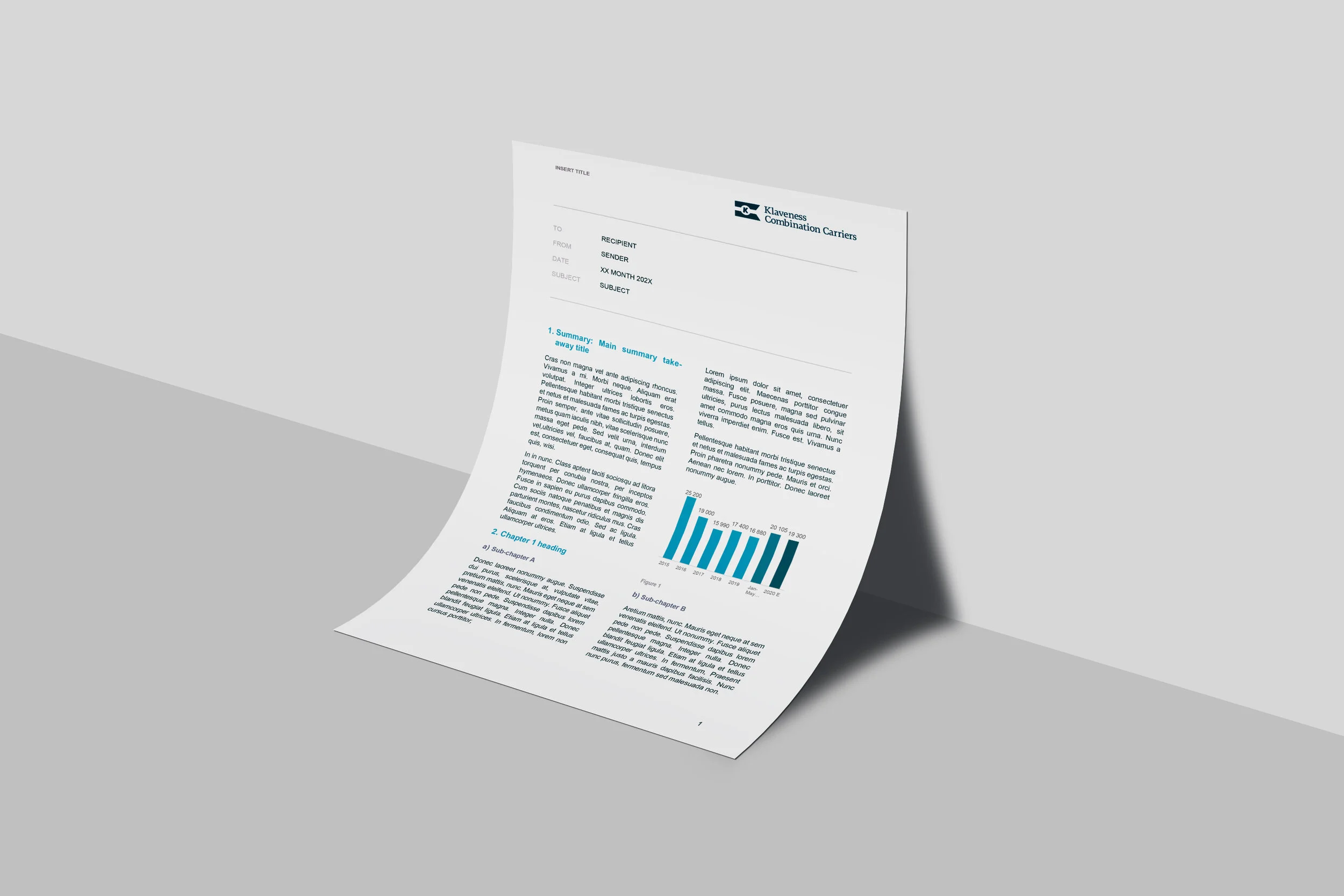
Memo template
Letterheads
Email signature
Business cards
PowerPoint template
The PowerPoint template is available through the template library in PowerPoint and can also be downloaded here.

Power BI template
In order to add the Klaveness Combination Carriers theme to your Power BI dashboard, you must download the theme and apply like described here.

Letterheads
Letterheads and envelopes should display information such as address and contact information of the relevant business unit or office. Letterheads should display information in the top right corner and envelopes should display information in the top left. This applies to all standard shapes and sizes in both envelopes and letter heads. You may download letterheads here and request envelope design by sending an email to lkg@klaveness.com

Email signature
There are two signature versions available for download, a standard signature and employees are to use when communicating on behalf of another Klaveness company. If you are employeed in Klaveness Combination Carriers ASA for example, and communicate on behalf of Klaveness Ship Management AS, you must always use the “On behalf of Company” signature in your correspondence.

Business cards
We have business card templates for both employees and external consultants.

Slogan
Future bound is our slogan and underpins our continued commitment to be a progressive voice in deep-sea shipping and taking an active part in the transition to low carbon shipping.
There are two variations that may be used. The slogan is not to be stretched or altered in any way, and can be applied on top of images or backgrounds in white or KCC blue.

Images and icons
The style of the photos and used by Klaveness should appear natural. Photos should be bright, of high quality and present elements in a delicate and visually interesting style. Colour and contrast can also be used as stylistic devices. Avoid filters and additional graphic elements in the images. Use the existing palette as a reference for new images and illustrations.


